

Wednesday, October 5, 2011
V is for Volume
Turn it up, y'all. Sorry I've been MIA. I had a baby & don't sleep much anymore. It's the greatest & most tired I've ever simultaneously felt in my life! Font used today: Orator

Monday, September 19, 2011
U is for Undo
U is for Undo. A keyboard command I sometimes wish I could use in real life situations. Font used today: Helvetica


Thursday, September 15, 2011
Personalized Name Blocks
Jett's room is pretty much ready for his arrival, but while I'm trying to pass the time as we ever so patiently wait, I decided to do a little crafting. I had some wood blocks cut back when we were working on the Airstream, & I've been meaning to make something out of them. So, here's what I came up with.

I bought some of those tiny paint samples from Home Depot for about $3 each. They'll get you any color you want. You get a lot more paint than you would from the craft store that way too.
WHAT YOU'LL NEED:

•Cutting Mat
•X-Acto knife
•Ruler
•Contact Paper
•Wood blocks or any other surface you want the letters transferred to
•Paint
•Paint Brush
•Printed sheet of letters of your choice in font of your choice | I used one of my faves Deming. It's free here.
1. Cut each letter out carefully with the x-acto & ruler to make it nice & neat. To save a little time, you could print the letters onto contact or sticky paper instead, but I'm not sure if my printer would allow that.

2. Turn the letter upside down so it's backwards & trace it onto the back of the contact paper. I used one of the blocks & a small piece of painters tape to keep the contact paper from curling up while I was trimming.

3. Place the letter exactly where you want it on the block (or whatever surface you decided to use). Make sure you smooth it out as much as possible.

4. Paint over the entire surface. Or part of it. Get crafty. Do whatever you want!


4. Now for the fun part! After the paint dries, carefully peel the contact paper off. If you want, you can lightly scrape the uneven parts away. I kind of like the unevenness of it though.
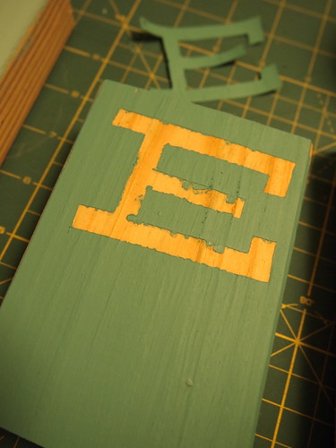

And you're all finished!


I bought some of those tiny paint samples from Home Depot for about $3 each. They'll get you any color you want. You get a lot more paint than you would from the craft store that way too.
WHAT YOU'LL NEED:

•Cutting Mat
•X-Acto knife
•Ruler
•Contact Paper
•Wood blocks or any other surface you want the letters transferred to
•Paint
•Paint Brush
•Printed sheet of letters of your choice in font of your choice | I used one of my faves Deming. It's free here.


T is for Teal

Friday, September 2, 2011
S is for Sailboat
Meet the vector version of the Evy Pearl. She's the newest addition to the fam until Jett gets here, & we've enjoyed her more than we ever thought we would! I think this will eventually be a really fun father / son bonding experience. Font used today: Kewl Script


Thursday, September 1, 2011
R is for Ross
Bob Ross, that is. Who doesn't love to watch this guy paint? It's magical! I haven't seen him on TV since he died, but if I did, I'd sure watch. I love those happy little trees of his. Font used today: Kravitz Thermal


Thursday, August 25, 2011
Q is for Queen
So, we're not the biggest Queen fans in the world, but we like 'em. Q is a tough one! Font used today: Adobe Caslon Pro


Tuesday, August 23, 2011

Friday, August 19, 2011
O is for Optimus Prime
"...and she gon' transform like Optimus Prime." Yep. Just quoted a Chris Brown song. Suuure did. Font used today: Transformers


Thursday, August 18, 2011

Wednesday, August 17, 2011
M is for Motorcycle
To Jett: Do as I say, not as your father does. Just for future reference. Font used today: Sketch Rockwell


Friday, August 12, 2011
L is for Lost
If you weren't / aren't a fan of Lost, this might not make sense. If there were baby bottles on the island, I bet they'd look like this. Font used today: Impact


Wednesday, August 10, 2011

Monday, August 8, 2011
I is for Ice Cream
Yum! We've been eating a lot of ice cream this summer. Jeni's is my new favorite ice cream place! If you live in the Nashville area, you should definitely try it out! Check their web site for other locations.


Thursday, August 4, 2011

Wednesday, August 3, 2011
G is for Gummi Bears
Hooray for Gummi Bears! I think this one mostly applies to me, although Jonathan also likes Gummi Bears too, but I really like 'em. Font used today: Museo 500


Tuesday, August 2, 2011

Monday, August 1, 2011
E is for Eames
Happy Monday, y'all! Glad to start the week off with E for Eames. The Eames's are probably one of my favorite historical couples. They were as passionate about their work as they were each other, & I think that adds up to a fantastic business partnership. Read more about Ray and Charles Eames here. Font used today: Lubalin Graph

An adorable photo of the Eames.


An adorable photo of the Eames.
Friday, July 29, 2011

Wednesday, July 27, 2011
C is for Cool Car
Aaaah, the Ford Fairlane. Probably should have done this as "F," but I think it fits right nice under "C." Font used today is Kewl Script.


Monday, July 25, 2011
A is for Adler
Well, hello there, Stranger. it's been a while. Momma's been busy designing the nursery, going to doctor appointments, & getting prepared for the new addition to the family. I've decided to design a set of flash cards, more than likely for decor use only. The majority of the subject matter will be things Jonathan & I are interested in. Maybe one day we'll look back & laugh, or maybe one day Jett will use it as decor in his kids room. Who knows. But for now, it's just fun. Each day, I'll either illustrate a letter or object to use on the card, then at the end, I'll make one big poster. I'm not sure if my objects on the card will actually help a child learn the alphabet. I just want them to be pretty and significant. So without further ado, here's A for day one.

Jonathan Adler. Love his design. From the geometric patterns to the quirky sculptures and especially the color palettes. I think JA is deserving of the beginning of the alphabet flash cards. Font used today is Gotham Medium.
See you tomorrow for "B!" Ooooh, what's it gonna "be?" Hahahaha! (I failed to mention I have the sense of humor of an 80 year old woman since I've been pregnant). Thanks for stopping by! Sorry for my absence :)
Friday, June 3, 2011
Patio Before & After
Finally almost finished! I got all pregnant and distracted from my patio makeover and started researching baby decor instead. I would still like to add a few things on the walls, but for now, it's a much more enjoyable space than before. And not an expensive makeover either! Check it out!

Before, there was a random chair and unused lamp.

After, we hung a $40 hammock from Lowe's, removed the random chair & placed the lamp behind the hammock for easy reading. Jonathan & Merissa brought the wood stack over back in the winter so we could build a fire, but I like it as decor better :)

Before, there were drab, white cushions with dog prints all over them and only one lonely side table.

After, we added custom Trina Turk pillows from Lounge Interiors (site to be live soon!), removed the former white cushion backs, bought a $24 side table from TJ Maxx & added a few $10-$15 candle holders. We washed the seat covers, but apparently somebody named Buzz found his way back on to them...The splashes of the teal make me very happy. You'll probably see the happy splashes of teal again soon in Baby Singleton's room.

Before, the lack of color made this space completely boring.

After, we added a $20 outdoor mat from World Market that made all the difference in the world!
And two more photos for the finale.


So that's that! Hope you enjoyed the patio makeover!


So that's that! Hope you enjoyed the patio makeover!
Wednesday, May 25, 2011
A Bargain Shoppin' Kind of Gal

If you know me, you know I love a good bargain. I know where all the clearance sections are at Target & I always make a beeline for the sale room at Anthropologie. I'm also guilty of sometimes purchasing things on sale just because they're on sale. But after watching a few episodes of Hoarders, I've gotten much better about that, and only buy things that I need. Well, OK, maybe I don't need half of the things I buy, but I like to make my house and myself look as pretty as possible:) I also do research before I make any big purchase. Mainly because I've shopped the sale racks my entire life and have learned that, in most cases, I can find it cheaper somewhere else. Not everything though. Sometimes I see something that I know I can't pass up, and I go for it. But when it comes to electronics, books and furniture, I become a bargain hunting machine.
Here's a few tricks I've learned along the way:
1. When making online purchases, ALWAYS google promo codes for the site you're purchasing from before you check out. Retailmenot.com is a good source for this. This can also be used with #2 below.
2. Subscribe to Ebates.com here. You'll get a percentage of your purchase in cash back if you link to the site you're going to through the ebates site! I just had to reorder some perfume and makeup from Sephora the other day, and got 12% cash back and saved $10! Also purchased my pricey camera on there and got a $17 check in the mail! Most stores you shop at online are on there too. Like Target, CB2, Walmart, Best Buy, Dwell Studio, Bath & Body Works, and TONS more. It's awesome.
3. Subscribe to local coupon emails, like Groupon and Living Social. They email you deals in your neighborhood every day! I have a friend who uses these for personal maintenance, such as teeth whitening and waxing. As women, it helps us feel a little less guilty about spending a little something on ourselves! We deserve to be pampered at a bargain price, right?!?
4. If you go to Target all the time like me, get the Target app. (if you have an iPhone) You can get coupons straight to your phone, then the cashier can scan the bar code on your phone for the discount. Not usually a huge discount, but fun to use either way. Also, Michaels craft store now scans phone coupons. Very handy when you leave your printed one at home:)
Hope you enjoyed my few tips on how to save a few bucks! If you have any good tips, feel free to share!
Tuesday, March 22, 2011
Beautiful Illustrations: Eleanor Grosch
If you know me, you know I love simple design with a great color palette. Clean lines, blocks of color, and a touch of a nostalgic feel. That's probably why I'm such a huge fan of the illustrations of Eleanor Grosch. Her prints are absolutely gorgeous. I purchased the skull print and had it framed in a chunky white frame as a gift for my sister, and I think it might have been one of her favorite gifts from me yet. And not only are they gorgeous, but they're insanely affordable. So buy yourself one, then buy one for your favorite friend!
Along with her prints, she also designs adorable greeting cards, t-shirts, coffee mugs, cd covers, posters, fabric and a ton of other goodies. I've seen her designs on keds shoes, baby clothing, diaper bags and even tiny sketchbooks at Urban Outfitters. She has such a distinct style that I know her work the second I see it! I hope you enjoy her work and are as inspired by it as I am! Here are a few of my favorite works of hers. Click here for her full site.


Along with her prints, she also designs adorable greeting cards, t-shirts, coffee mugs, cd covers, posters, fabric and a ton of other goodies. I've seen her designs on keds shoes, baby clothing, diaper bags and even tiny sketchbooks at Urban Outfitters. She has such a distinct style that I know her work the second I see it! I hope you enjoy her work and are as inspired by it as I am! Here are a few of my favorite works of hers. Click here for her full site.


Wednesday, March 16, 2011
Sun Room Makeover
Spring is just around the corner. Or is it already here? I can't ever tell. It's pretty nice today and should be even nicer and warmer soon, and I've been thinking about updating our screened in patio. It's such a fun space in our house, and it's the first thing you see when you come in the front door. But somehow, it seems to get overlooked. Last summer, we spent a lot of time expanding and updating our back deck, and that's usually where we end up when we are entertaining. So this year, the sweet sun room is going to get a cozy makeover. It's going to be perfect for those extra hot days since there's already a ceiling fan in there! So here are a few ideas and things I've discovered so far.

I've already started gathering a few things (like that awesome hammock swing x2) so hopefully I'll have before and afters within the next week! I want this space to feel relaxed and soft with a kind of beachy vibe with lots of curves as opposed to straight lines. I can't decide if I should use a strand or two of lights, but those little bird lights from Pottery Barn are calling my name! I want it to be nice at night too, so I'm going to try to find some nice candle lit wall sconces to make sure our nighttime sun room is extra vibey:) Stay tuned for more updates!

I've already started gathering a few things (like that awesome hammock swing x2) so hopefully I'll have before and afters within the next week! I want this space to feel relaxed and soft with a kind of beachy vibe with lots of curves as opposed to straight lines. I can't decide if I should use a strand or two of lights, but those little bird lights from Pottery Barn are calling my name! I want it to be nice at night too, so I'm going to try to find some nice candle lit wall sconces to make sure our nighttime sun room is extra vibey:) Stay tuned for more updates!
Monday, March 14, 2011
William Eggleston
I'm not the world's biggest fan of photography, but there's something about the photography of William Eggleston that I can't get enough of. Maybe it's that he's from the south (Memphis to be exact), and he captures moments or objects that we see every day and makes them seem beautiful. Or maybe it's how beautiful all the colors are in his photographs. After all, he has been dubbed "The Father of Color Photography." Either way, I just wanted to get the word out in case you're not familiar. Also, for my Nashville friends, he has an exhibit up at the Frist right now. Definitely check it out if you can. You won't be disappointed! Here's his web site so you can see a lot of his work, and below are a few of my favorites.


Hope you like these photos as much as I do! Happy Monday!
Hope you like these photos as much as I do! Happy Monday!
Subscribe to:
Comments (Atom)